Torontune
App design and Development
An app for TTC commuters to scan musician's id to view their profile so they can donate and support Toronto local musicians.

An app for TTC commuters to scan musician's id to view their profile so they can donate and support Toronto local musicians.
Capstone project for TTC Musicians. Created and app using React Native and Prototype using Adobe XD
Ideation . User Research Methods . Visual Design . User Testing . Prototyping . Development and then Reiterating
UX Designer and Visual Developer
Mihoko Schick [Full Stack Developer]
Hamza ibrahimi [Designer and Developer]
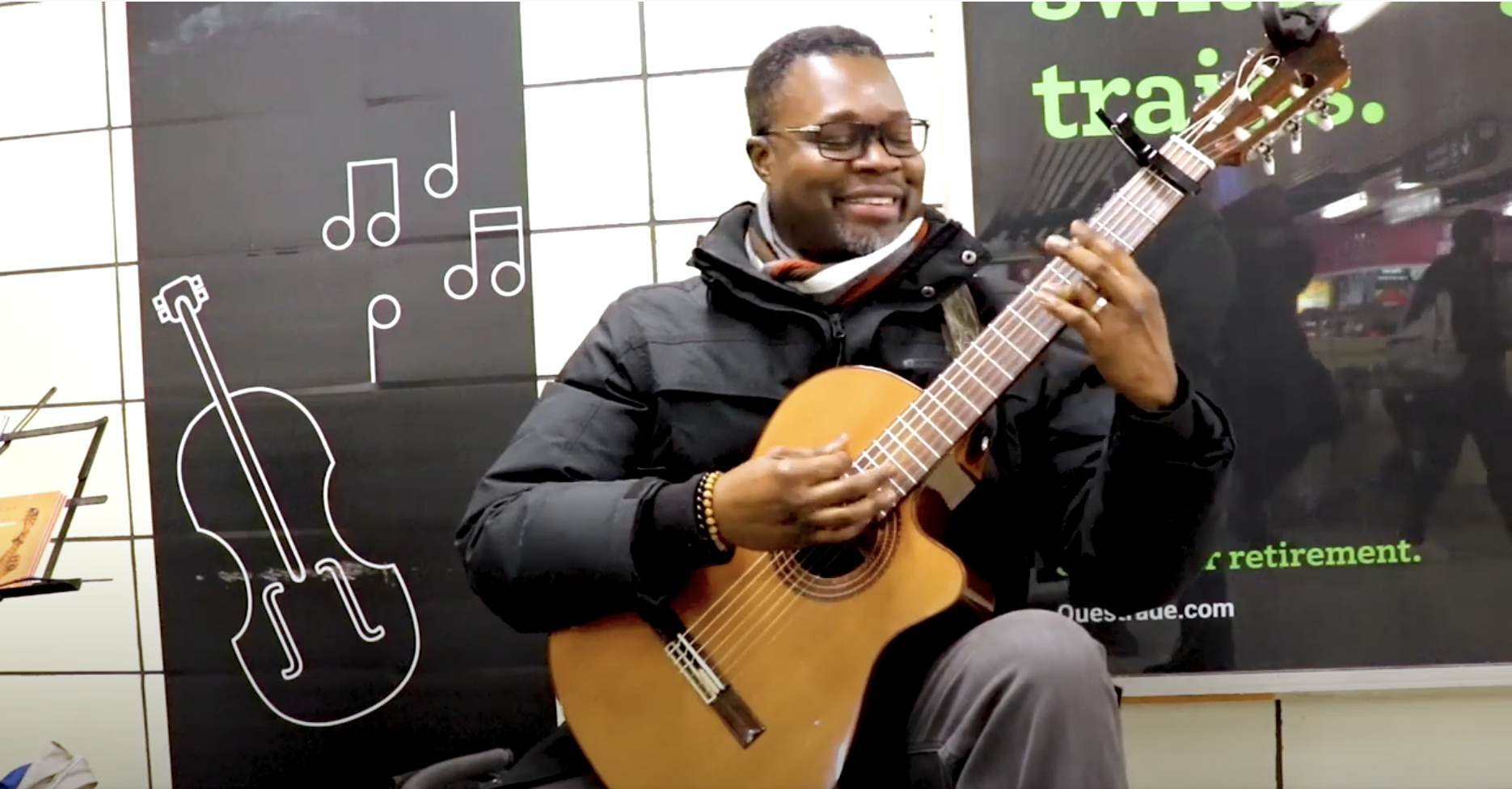
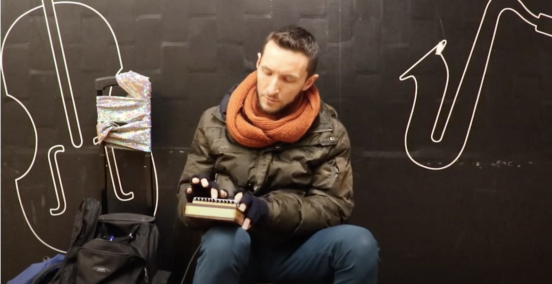
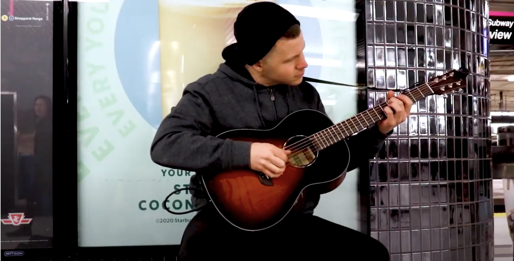
Torontune is an app for TTC musicians and commuters. TTC has provided a platform for subway musicians called “sound underground” for more than 35 years now. The process starts with an autidition every three years. TTC selects about 75 musical artists and issues them a licence with a unique ID. Torontune app helps those musicians to get donations, recognitions and encouragements through the convenience of an app.
As a team, we wanted to tackle a problem which could help our community. Ever since, people have started using smart pay, and tend to carry less cash or no cash at all. Commuters also are in a rush into getting to places and don’t have enough time to reward or donate these musicians. With all the social media exposure, musicians don’t have an online platform to share their profile. Commuters can’t see musician’s schedules and musician’s can’t see each other's schedules.
“I am planning on getting a debit/credit machine because there is absolutely no platform for street (or subway) musicians”.
Our goal is to create an app for commuters and musicians. This app will allow users to scan musician ID to retrieve their profile so users can donate, review and contact musicians. So, even if commuters miss out an opportunity to donate or communicate with musicians at the spot then they can do so by simply creating a secure account with Torontune.
We planned to divide our project into few phases:
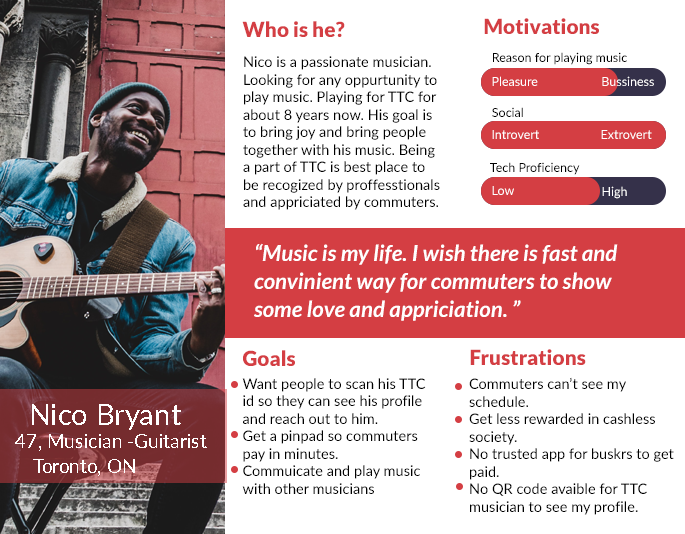
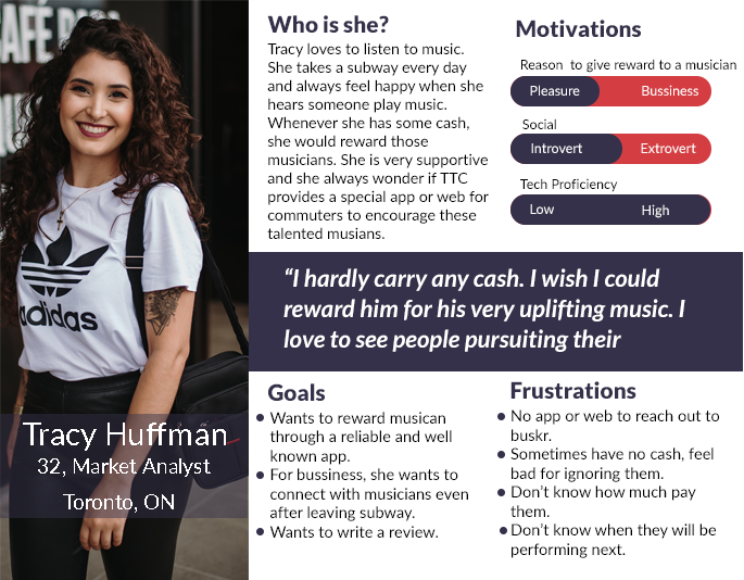
We asked about 10-12 users including musicians, commuters and student. Our target audience is age 20 and above. We managed to take interview from at least one person for certain age group. We observe people habits and motivations. We asked to introduce themselves and talk about their experiences with TTC and musicians. Some sample questions listed below.
➔ What is it like to be a part of the TTC music team?
➔ What are some of the struggles as being perforformer on the street?
➔ How do you get paid ? how ?cash on the spot only?
➔ Do you have a smartphone? Would you like it to get paid through an app? Would it be convenient?
➔ Would you trust to pay other street performers through an app or cash? Why?
➔Do you use TTC or the subway?
➔ Do you enjoy listening to street musicians?
➔ Have you ever rewarded them?
➔ How much of a donation will you be willing to give them? Min and max amount?
➔ Do you feel unhappy when you don’t have cash or coins?
➔ Would you ever think of paying them through an app? Would you trust the process? Why and why not?
We got positive and very information answers. We noticed people enjoy music, want to donate and reach out to Musicians. They agree to download the app and give rewards and encouragement to musicians. Even musicians became curious about this idea and definitely want to have an app like this in Toronto. However, almost all of them agree to use this app if it has good advertisement for reliability and security.
After researching problems, analyzing user research and creating personas, we decided to solve many problem we could. Here are some of the main features of the app:
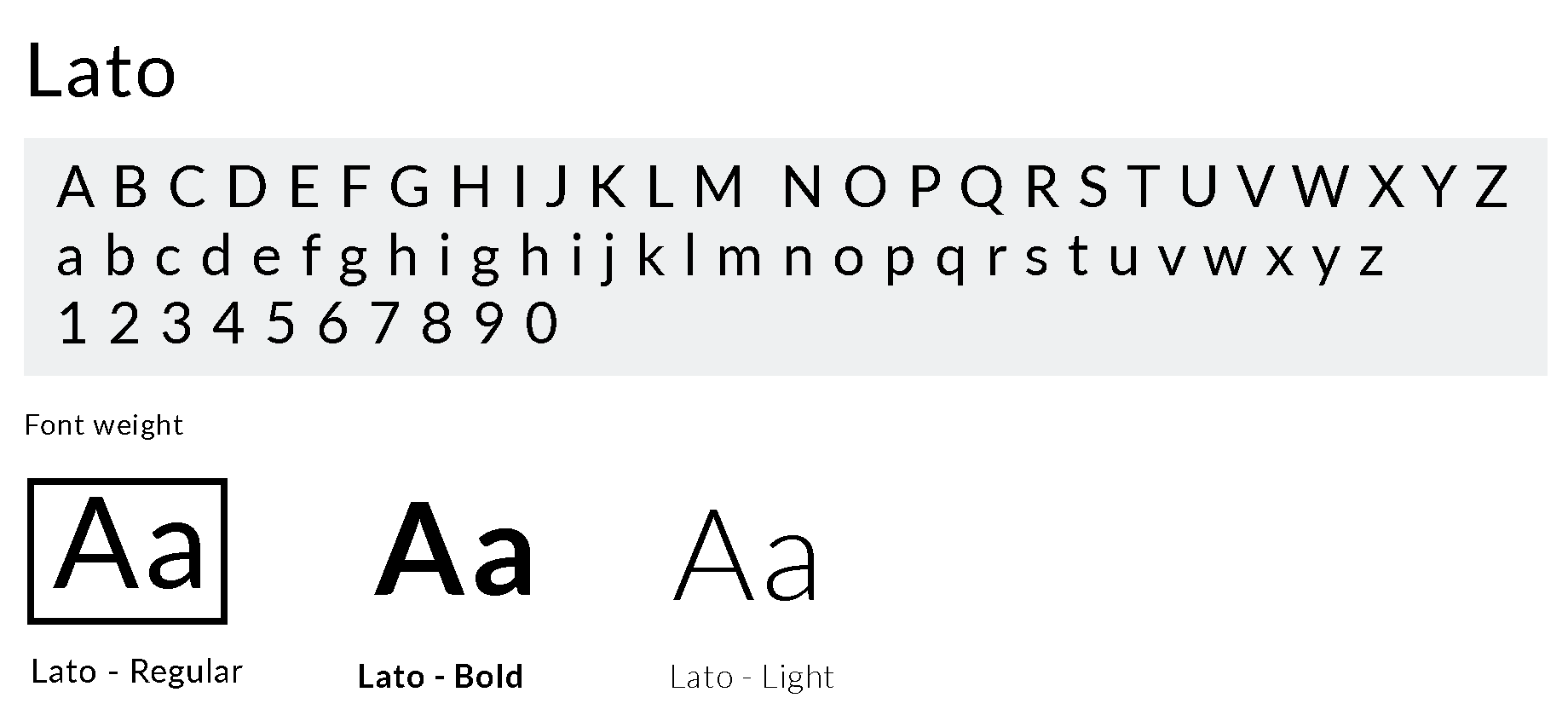
This app focus only on the Toronto users and the app is based on TTC subway musicians or buskers.As a team, we sketched out many ideas. In the end we end up collaborating all ideas into one. The font for the logo started off with Lato then variations were made.
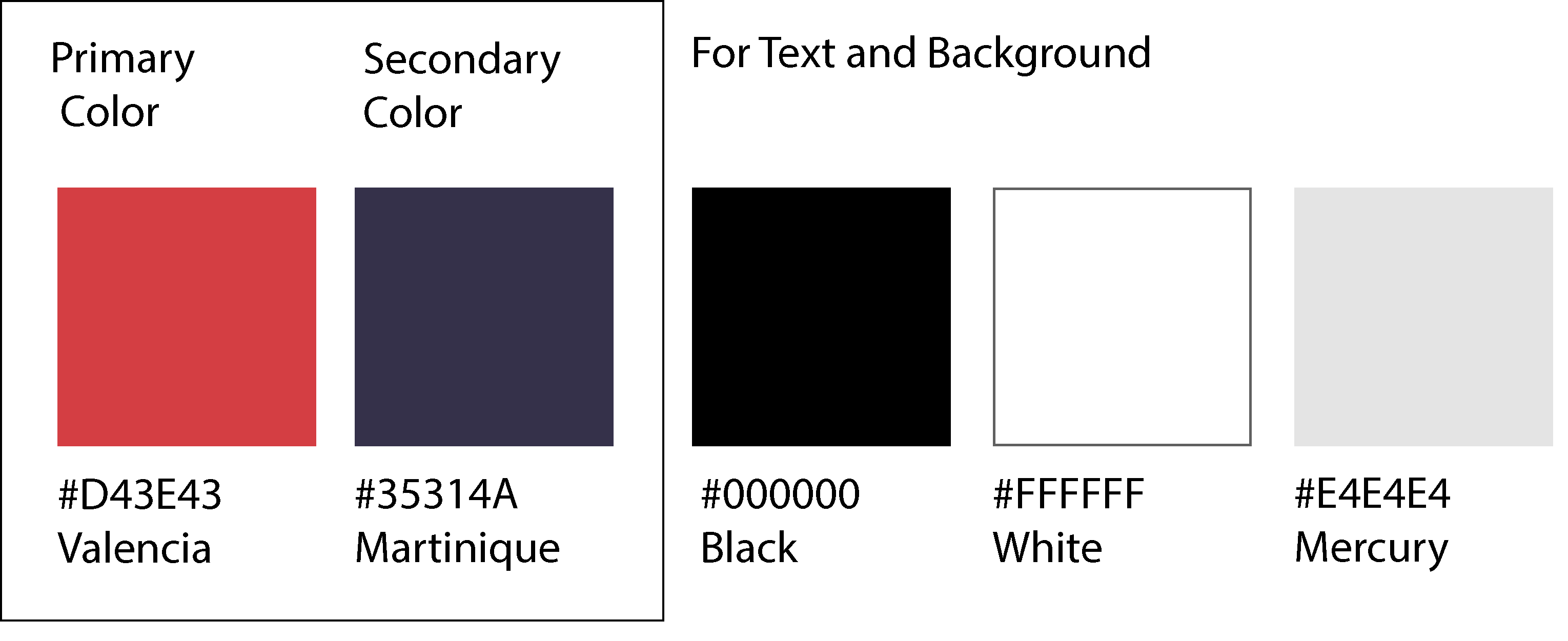
We decided to choose Valencia as our primary color because it is Canadian flag color. We chose Martique as our secondary color because it is a complementary color to Valencia. Overall we wanted the entire app to have a clean and minimal look so we chose Mercury for some background and for the rest of them White. For text readability we stick with black.
We experimented with some plain text with few fonts. We wanted to have a clean, readable and most familiar font. Lato seems to be the best one. This font is very common in apps. Also our logo started from the Lato font.
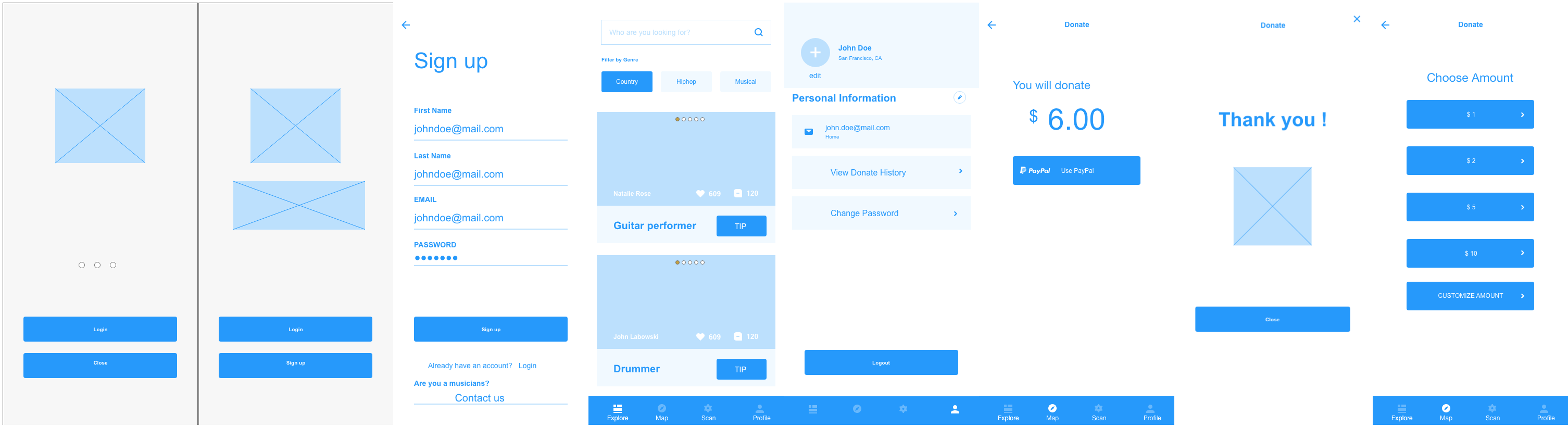
After getting feedback from interviewees, we created wireframes then prototypes. Our task was to retrieve musician’s profile so users can donate to musicians, review them and reach out them. Some of the findings from user testing are:
We reiterated our designs three times. We succeed in getting entire process from intro slides, to creating account, to browsing, searching for musician to donating them.
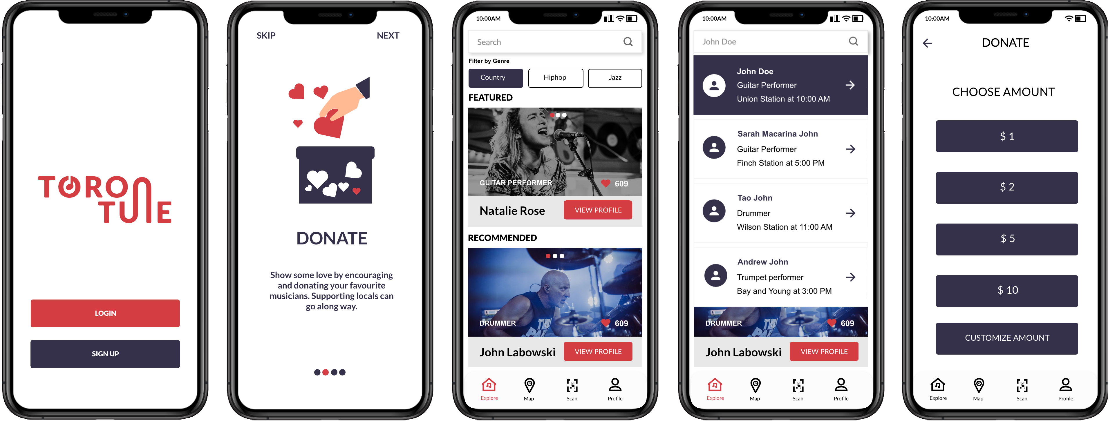
Overall, we created this app from a scratch and ended up with an actual app which was coded in React Native. However, the app was not published. Some main things we learned are: